Women of Wearables
Art Direction, Femtech Branding, UI Design, Spacial Design, Market Research
Redefining Empowerment
Women of Wearables is a global organization supporting female innovators and allies in health technology. While it brought together powerful research and talent, the previous identity lacked visual energy and didn’t reflect the brand’s empowering values.
This rebrand amplifies its mission—drawing attention to Femtech, inspiring action, and creating a stronger platform for growth and communication.
Brand Book↗
Symbol of Collaboration
The two 'W's represent collaboration and innovation, coming together to symbolize infinite possibilities.

From Static to Storytelling
Breaking away from the original site's static style, the new media design highlights wearables, celebrates the creative community, and showcases cutting-edge research in a visually engaging way.


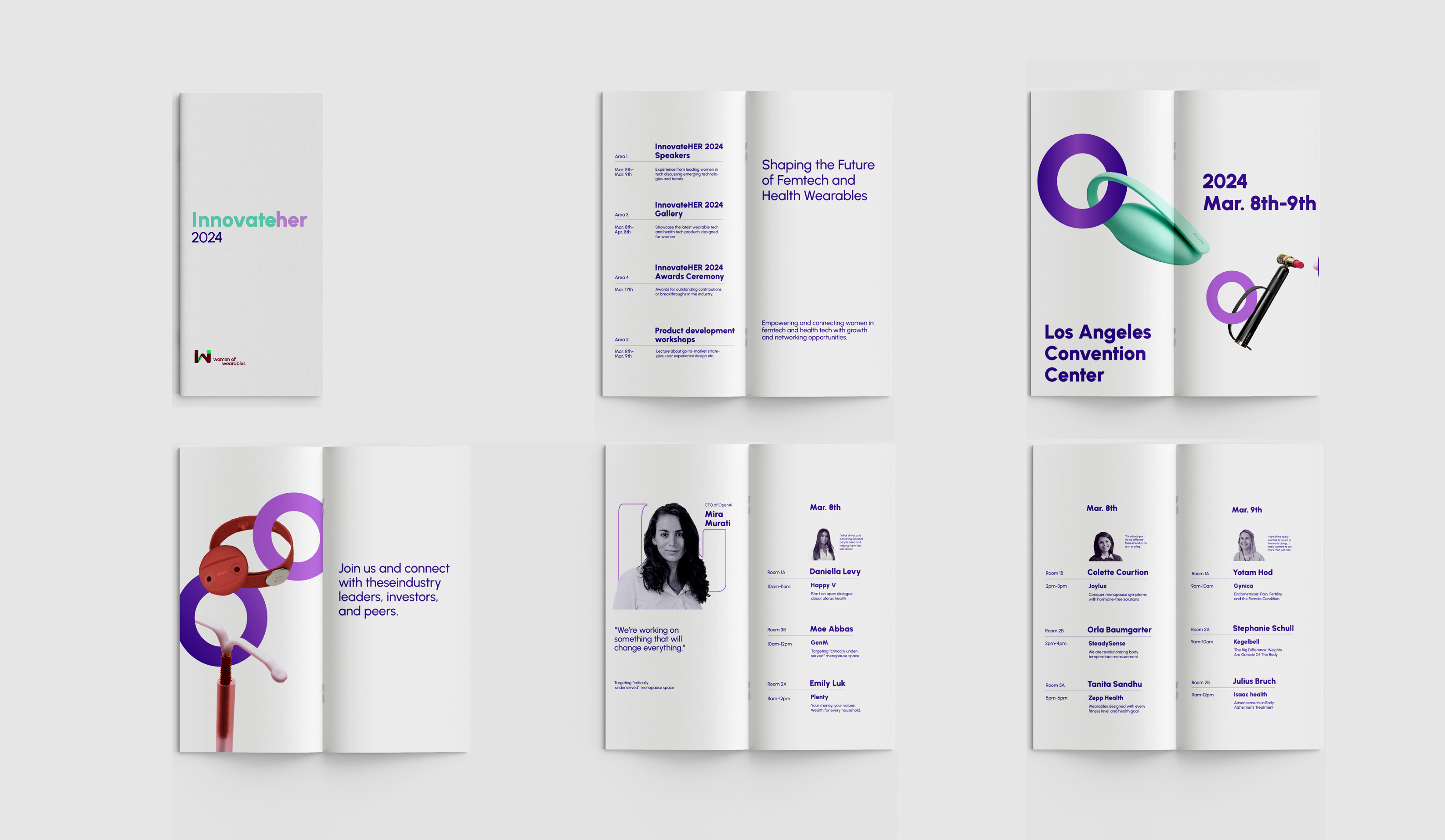
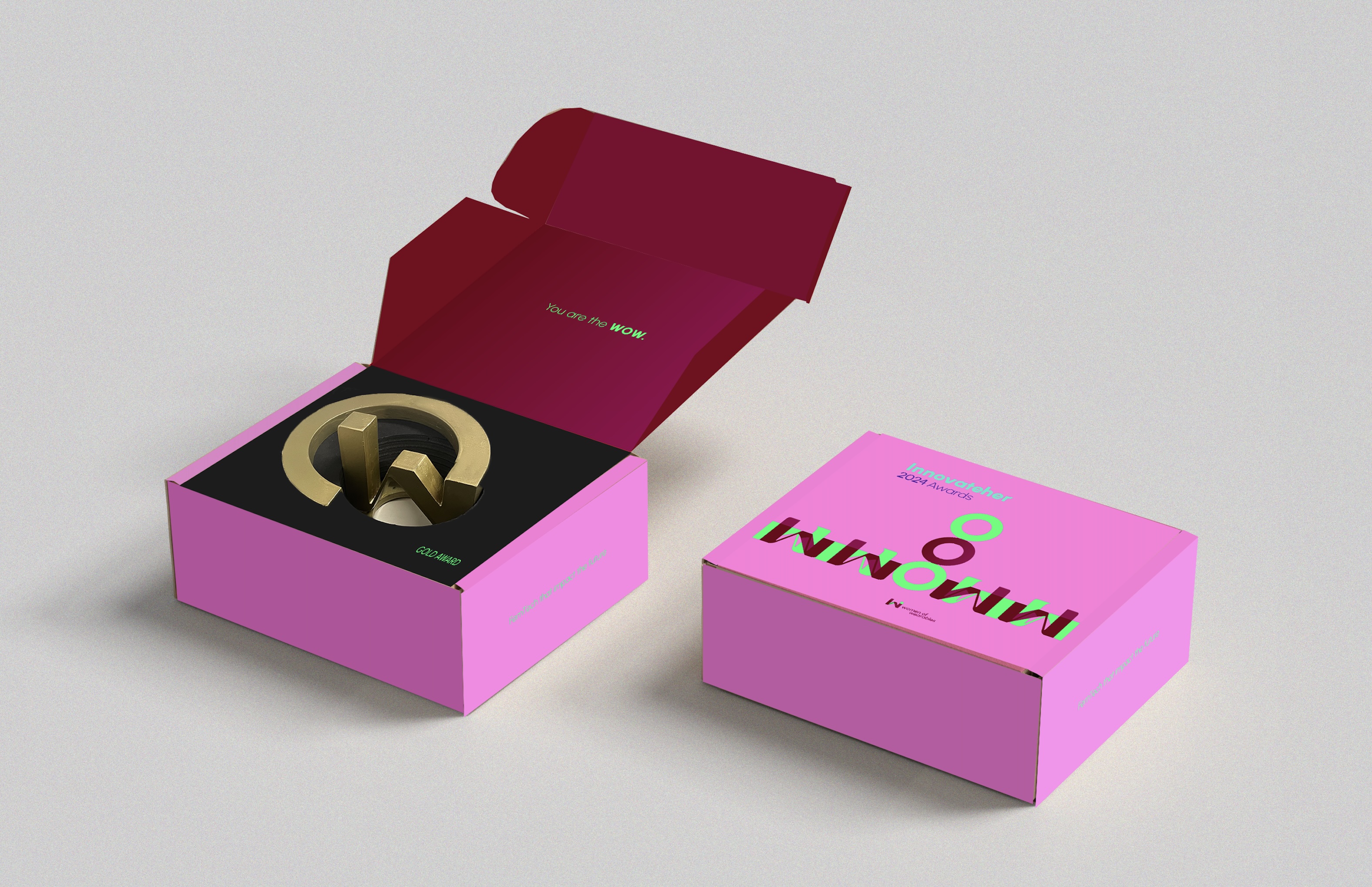
Building Community & Shaping Recognition
I'm proposing an event to connect women in femtech. At its heart is the ‘WOW’ Award I designed to celebrate changemakers—its form symbolizing our collective strength and creativity, focusing recognition on the field.


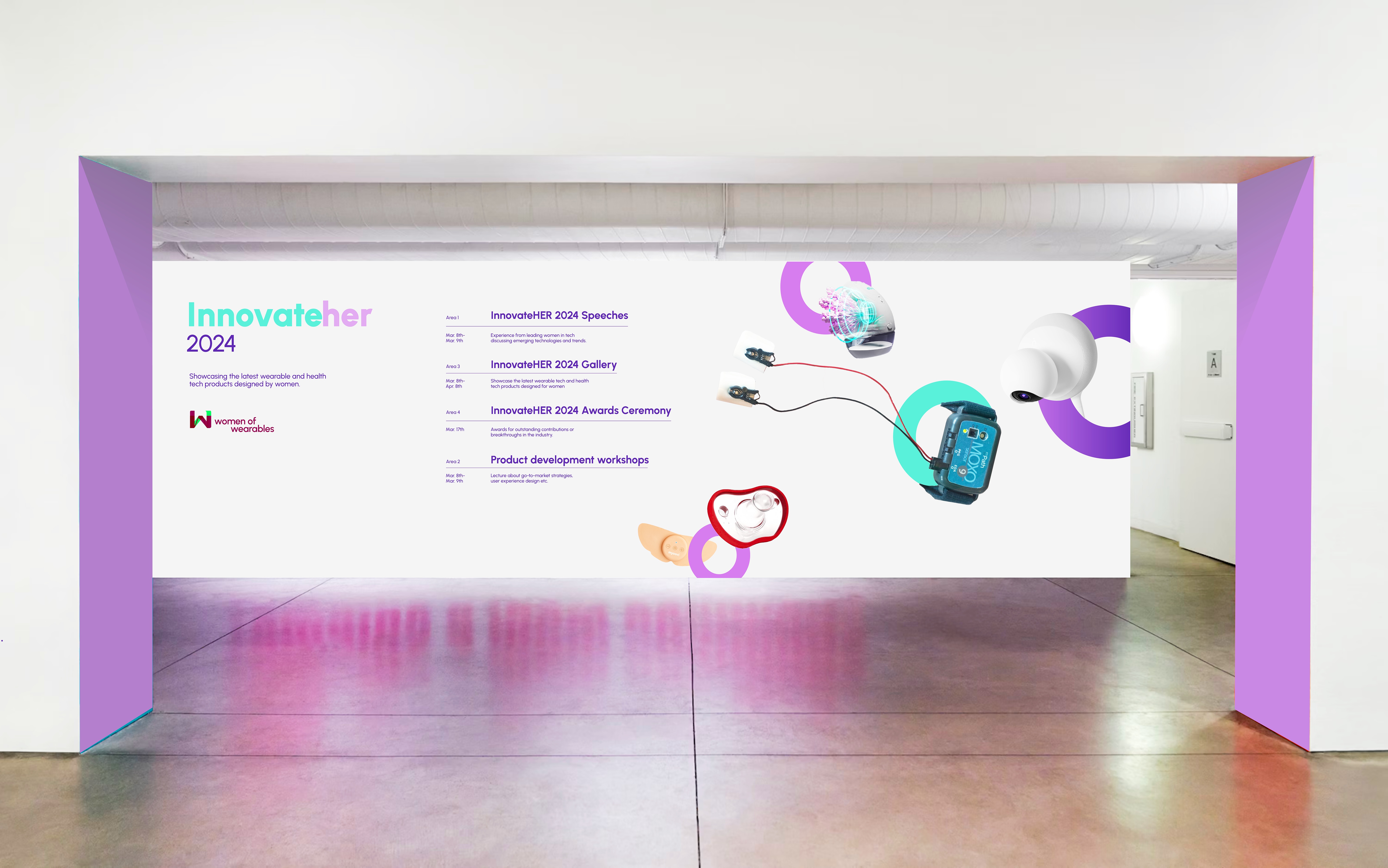


Space for Connection
Rooted in the brand’s motifs, the office transforms into a living system, encouraging interaction and continuous creative exchange.